

Mobile technology clearly seems to be taking over consumer behavior placing more pressure to produce solutions other than mobile apps, such as websites to be mobile-first optimized. With the rapid pace, newer and better smartphones are emerging, the focus is largely shifting towards providing better user experience on mobile, and for this websites have to be developed keeping this in mind. So much so, that even Google changed its algorithm in the favor of websites that were optimized for mobiles. This change, in turn, disrupted the page rankings, which lead to the downfall of great performing websites at the bottom of Google’s SERPs.
Now, it has become a priority for every software firm including a custom software development company in Houston to provide one-of-a-kind website that not only is user-friendly buy is mobile-friendly as well.
Before diving into how we can achieve that, let’s discuss the basics.
What is a mobile-first optimized website?
A website that is made to function properly on a mobile’s browser is a mobile-first optimized website. In detail it means that it is easy to view even on a smaller screen compares to a laptop or desktop’s screen. The text, images, and overall design page adjusts to that of the mobile screen automatically. Since there are several devices including tablets featuring different screen size, it is not easy to have your website run and display smoothly on every screen. However, with that being said, scaling format is coming quite handy to resolve this issue.
If you have a working website that is life, how would you know it is already working perfectly on your mobile, apart from the obvious checking it through your mobile browser? Here’s a little test that you can run, courtesy of Google.
Run The Test Here: Mobile-Friendly Test
Mobile-Friendly Website Statistics
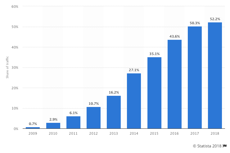
Safe to say, the majority of website traffic is being generated through smartphones. In the fourth quarter of 2019, according to Statista, mobile devices alone generated 52.6% of the website traffic around the world. Not only this, but Google’s preference for mobile-friendly websites is also a testament to an entirely different development trend.
So how can you make your website behave nicely on mobiles? We gathered a few pointers that will help you in this regard.
1) Responsive Theme Installation
You may have to revamp your entire website and the best way to start is by a great theme for your website. However, if you have a site that is established, both in the areas of high traffic and user retention, then it is not advised. Otherwise, if you are a low ranking site with low traffic then installing a brand new theme would do wonders.
If you are using a popular CMS like WordPress, changing them would be fairly easy.
• Go to your dashboard
• Under ‘appearance’ click on ‘themes’ and then hit ‘install themes’.
• Type in ‘responsive’ and then search.
Now all you have to do is pick one from the plethora of options in front of you and run tests on it, once installed.
2) Highlight your Call to Actions
CTAs are the most important part of any business or brand as they drive conversions or prompt the user to initiate an important task for which the website is built. It is necessary that you highlight the CTA buttons. But make sure you are not placing too many of them in a single screen, considering mobile screen will give you little to work with when it comes to displaying content.
So think about the objectives each landing page has to achieve and include maximum one or two CTAs. Moreover, your CTA should be easy to spot and interact with. Nearly 53% of the sites have CTA buttons on their mobile-friendly pages.
3) Add a Search Function
A search function or bar is great to not only keep your content minimal and allowing the users to take advantage of the search bar for easy navigation. This reduced the need to display a lot of items on the menu bar of your website. Besides, too many options distract and confuse readers.
For sites that deal with eCommerce have one integrated into their web design for a de-cluttered look whilst providing with all the options available on their regular site.
4) Customer Service Accessibility
Be sure to give them away to access your customer support, because no matter how great your website is mobile-first optimized, there will be customers that would require assistance. So make sure you provide your phone number, social media profiles, email address, and a chatbot for direct communication.
What matters is how quickly you address their queries. In order for your business to run successfully, customer service should be impeccable as your clients/customers come first. Also, it places a positive impression about your business on the minds of the users.
5) Say No to Pop-Ups
Even as I write I am reminded of the obvious newsletter pop-up that I have to close in order to access a website and how annoying that can be. Now that the screen real estate has been reduced and you have to choose carefully as to what content will be displayed, pop-ups should not even be on your list.
Even if you incorporate one, the ‘x’ sign will be small and unlikable leading to usability issues. And if a visitor has to zoom-in to click that, the dimensions are distorted leading to more annoyance. However, if somehow, a pop-up is an important part of your site that you simply cannot do without then I suggest you thoroughly test the design before hitting update.
Lastly, make sure you are placing the speed of your mobile site as the top priority. Mobile sites that take longer to load are immediately closed and forgotten – leading to increased bounce rates and zero traffic. Best solution? Keep your design simple and easy. No need for unnecessary images, videos, and animated elements. Simple to the point website would do.